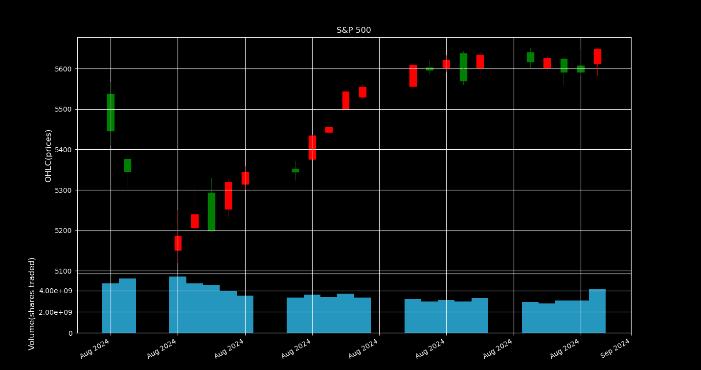
Over the month-long window from August 1 to September 1, 2024, the chart presents a combined view of the S&P 500’s price action and trading activity. In the top panel, each day is rendered as a candlestick whose body reflects whether the index closed above (green) or below (red) its opening price, with thin “wicks” marking that day’s intraday highs and lows. Directly beneath, the bottom panel shows daily volume bars aligned to the same dates, so you can instantly see which price swings happened on heavier trading days. By sharing a single date axis and cleanly separating price from volume, the plot makes it easy to spot correlations between market momentum and trading intensity.